MANSCAPE
Spec Work
Deliverables:
• Packaging Design
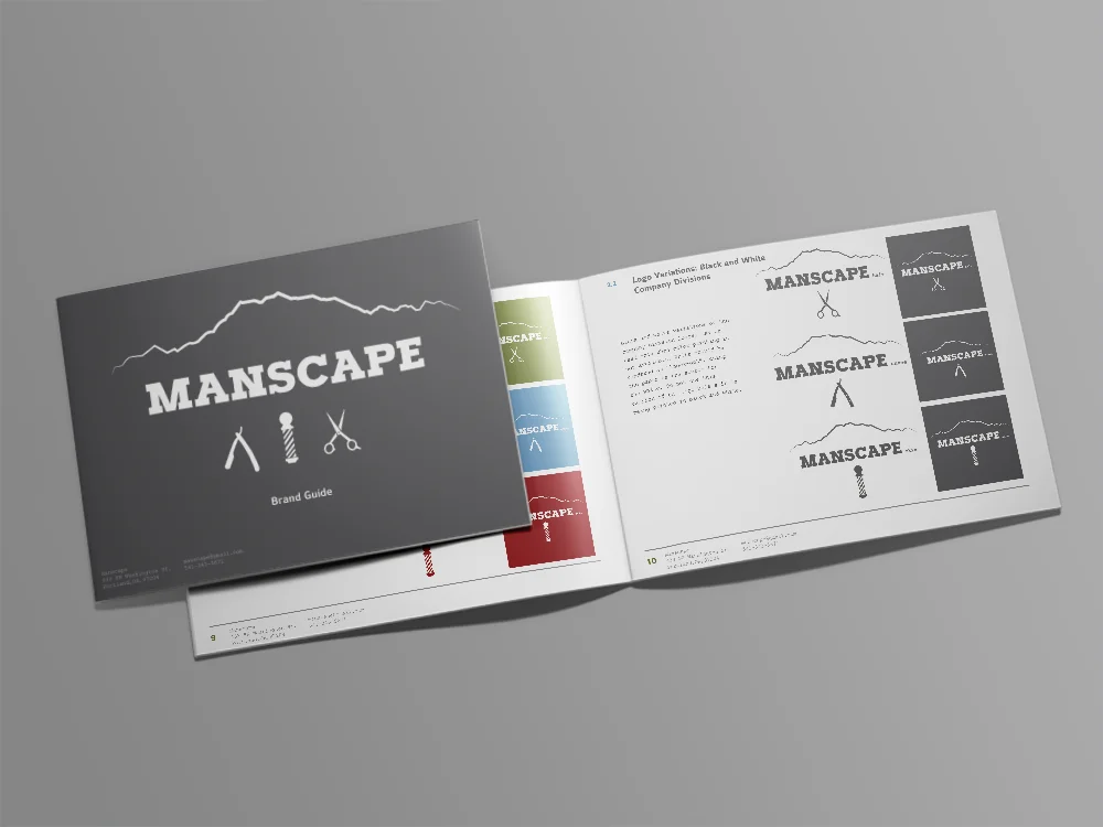
• Brand Guide
• Logo Design
Roles:
• PM: Sam Kaye
• Graphic Designer: Sam Kaye
Description:
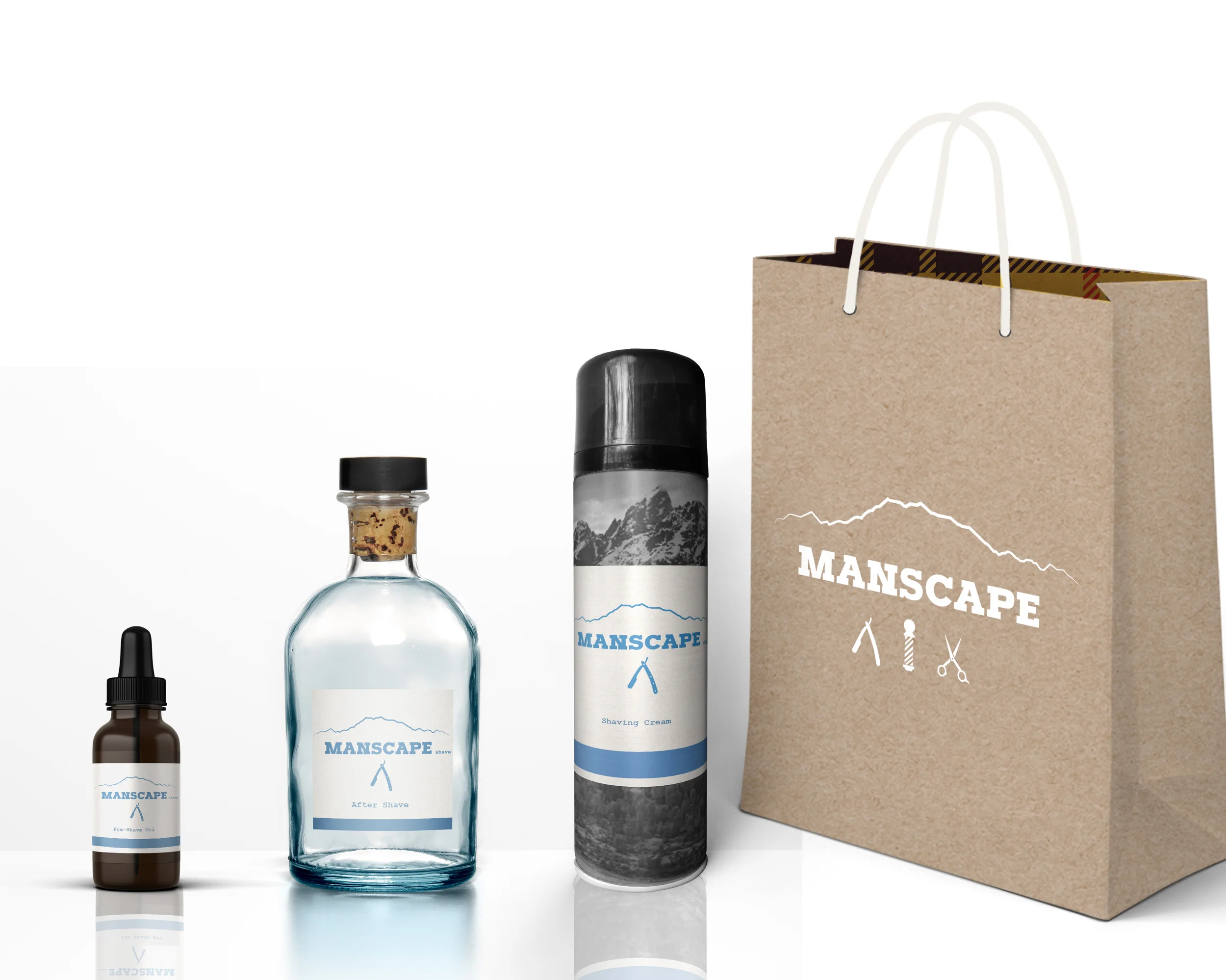
Manscape was developed as a mens grooming start-up that is based out of Washington State. The company is based around the idea of "lumber sexuality", brining a rugged yet classy tone into the branding. The client was looking for a full branding and packaging system that would help boost sales and enhance the vibe of the brand.
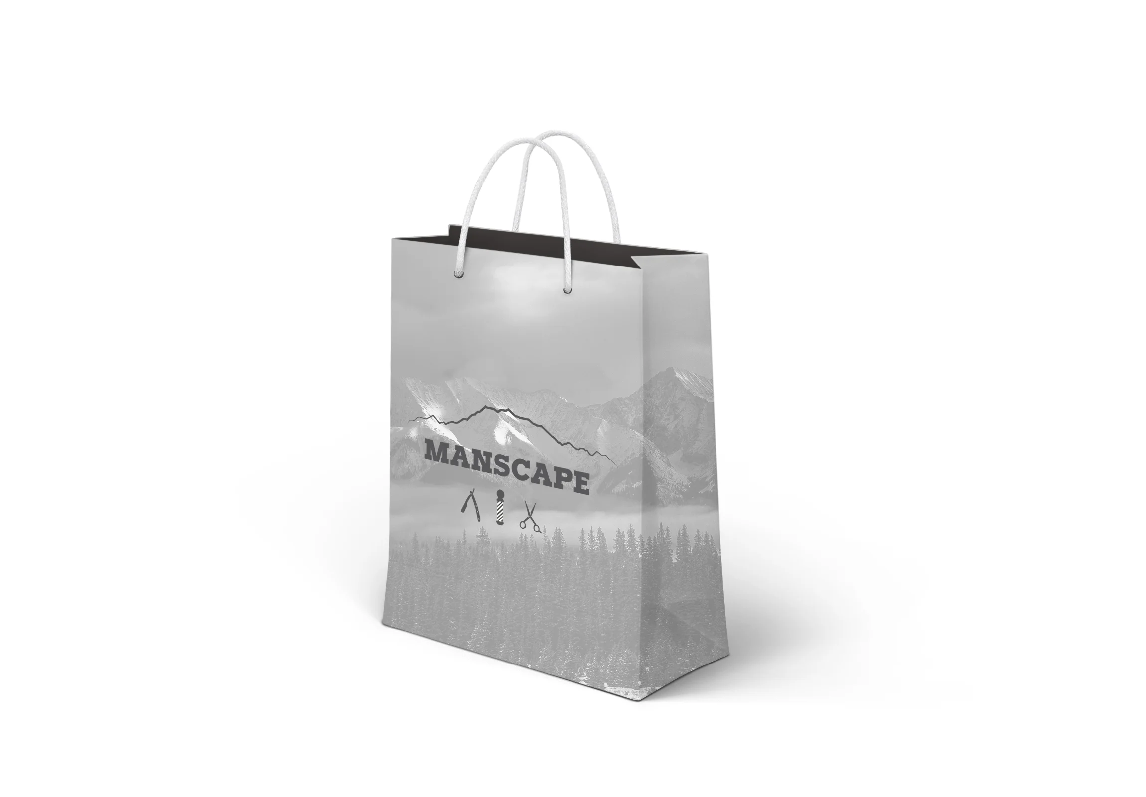
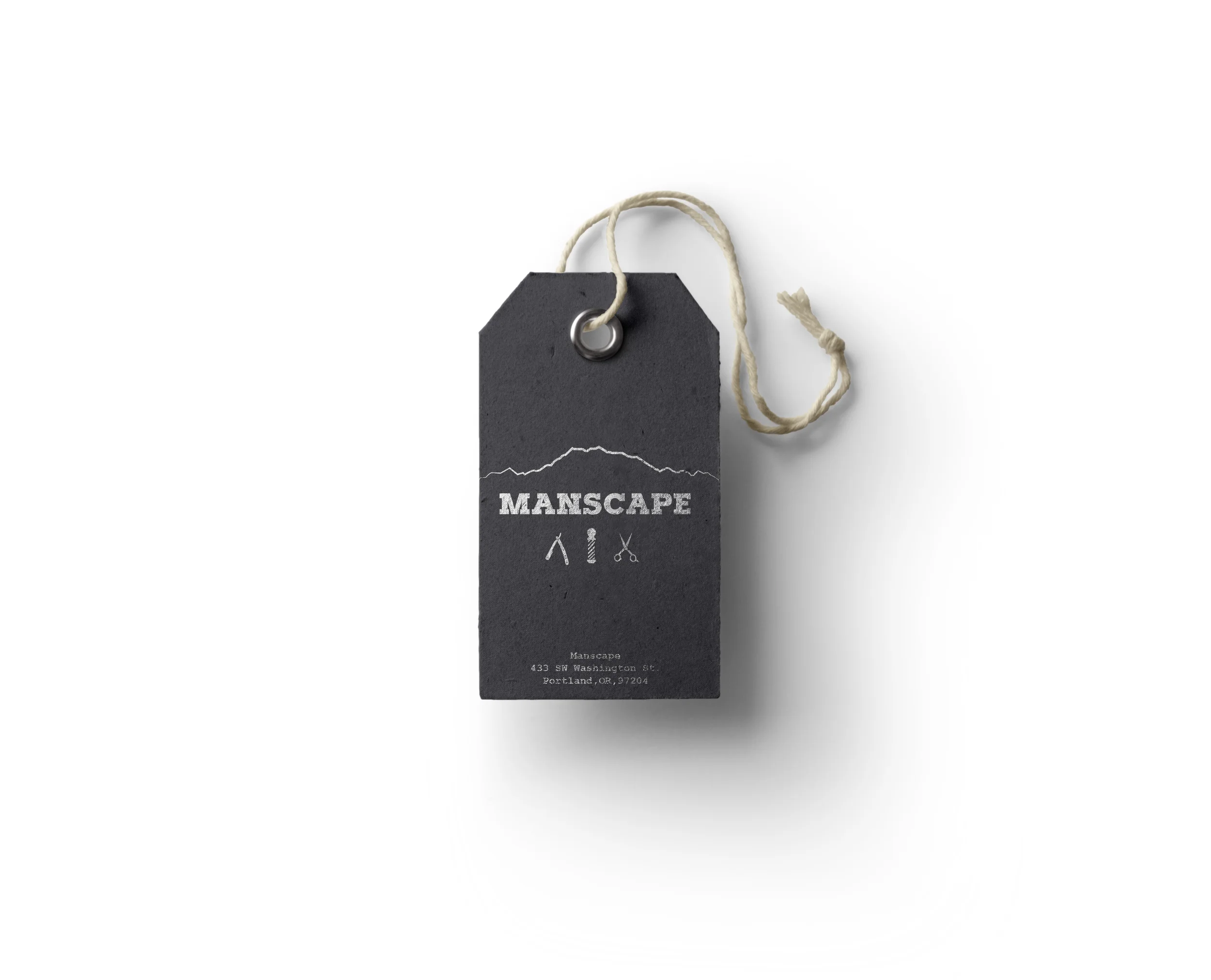
The first course of action was to create a logo for the brand. The logo gives a nod to the company's roots in Washington State, while also maintaining the idea of an outdoorsy rugged feeling by highlighting the silhouette of Mt Rainier. The primary target audience for Manscape is young professional men between the ages of 20 and 30, and the main goal of the company is customer retention by creating high quality, affordable products that can be used year after year.
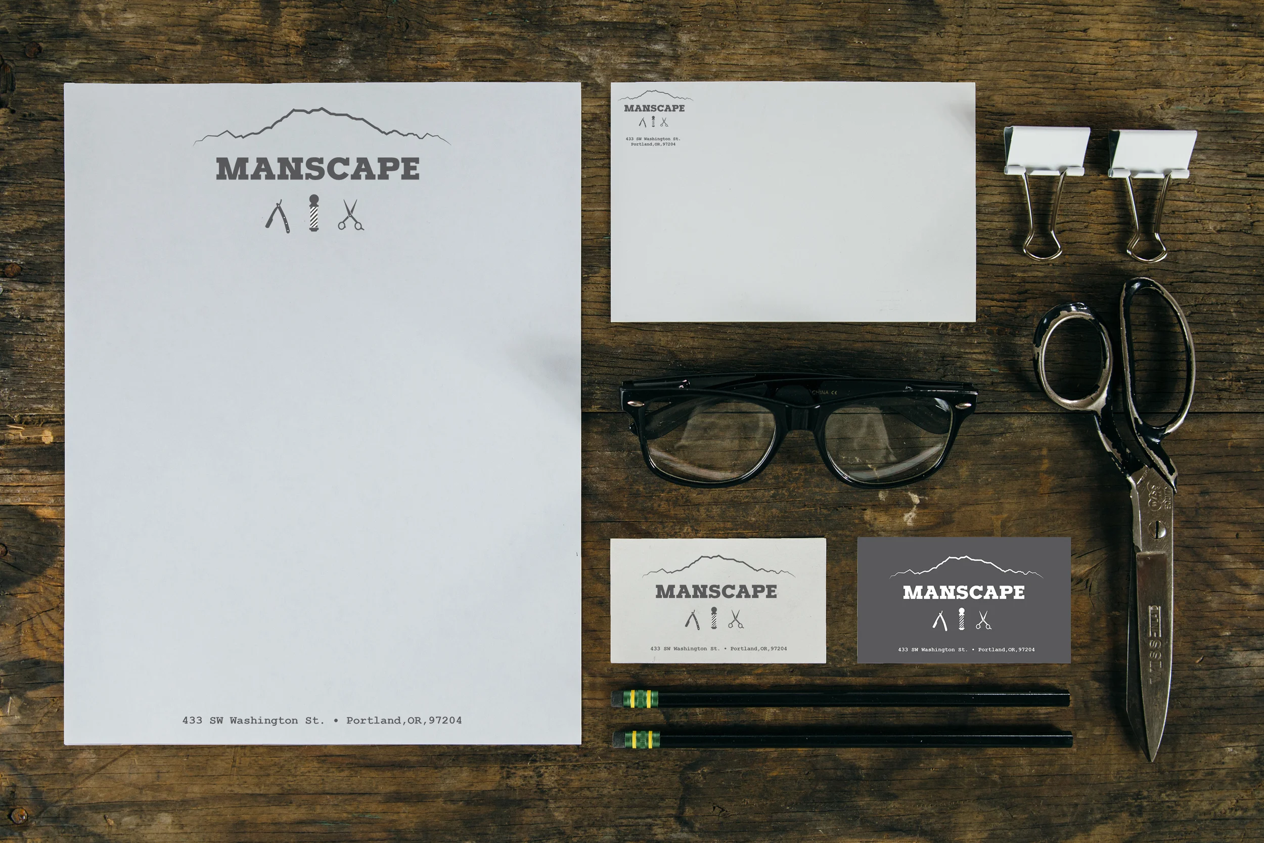
Once the logo was complete the rest of the brading began to fall into place. We chose what imagery would be acceptable and on target, and went through the process of picking a typeface that would clearly represent the ideology and messaging of the brand. A complete brand guide was created for Manscape to reference in all of their future marketing endeavors.
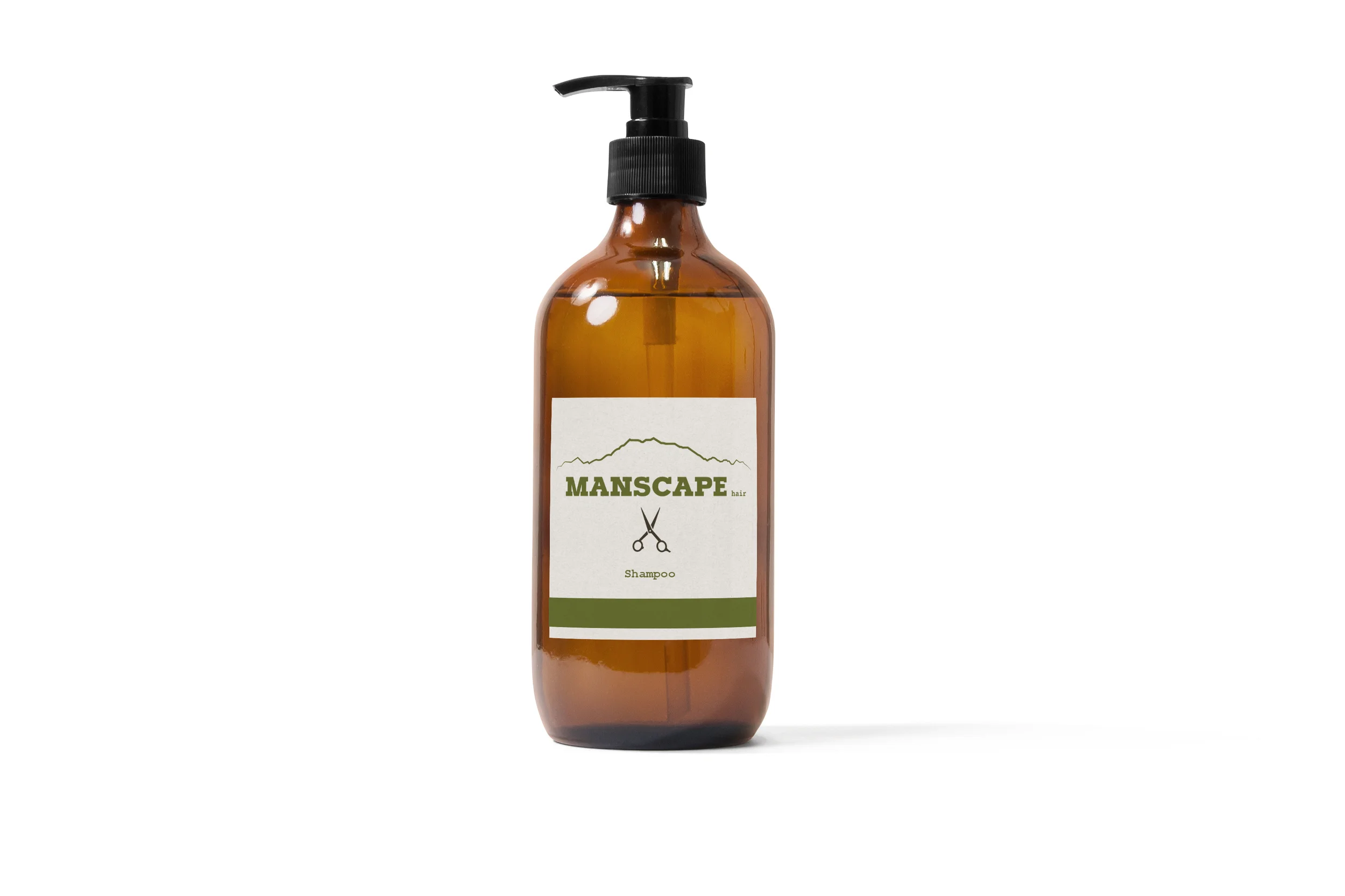
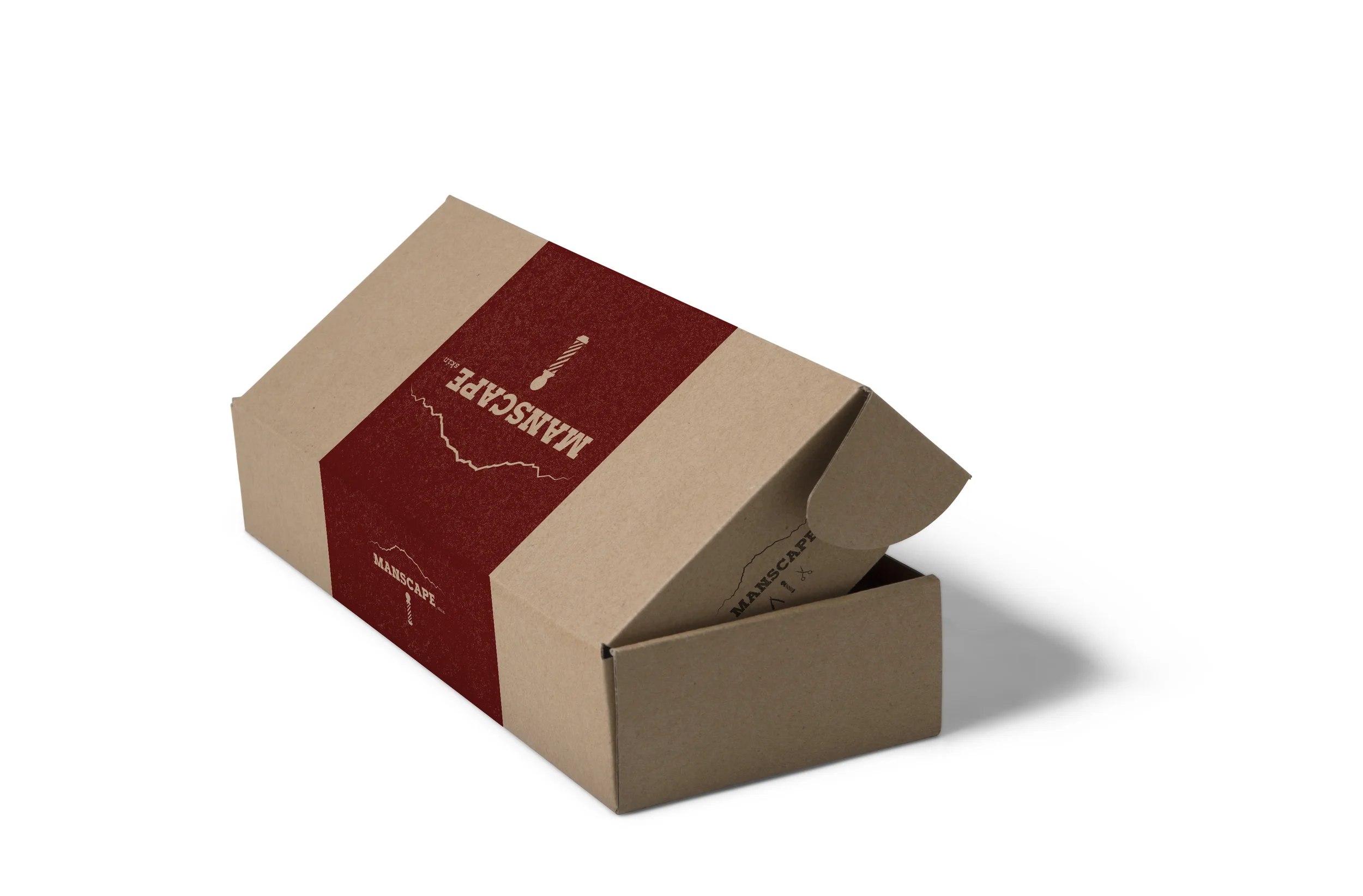
Once the branding was complete we moved on to packaging. To reflect the outdoorsy aesthetic, the packaging offered nods to the wilderness and "lumber sexuality". Boxes were lined internally with a plaid pattern, while bags displayed iconic mountains around the country. Labeling was clean and minimal to reflect the high-quality of the products. Overall this project entailed a great deal of design work, detail oriented communication, and strict time management skills. Managing this project was a wonderful experience that taught me a lot about creating a company and how branding really makes all the difference in messaging.